
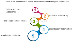
Mobile Search Engine Optimisation: A Practical Guide
Mobile search engine optimisation (mobile SEO) is the process of making a website easy to find and use on smartphones and other mobile devices. It combines technical improvements, useful content and a smooth user experience to help pages perform well in search results and meet visitors’ needs.
Mobile SEO matters because people often search, browse and make decisions on their phones. A page that loads slowly, is difficult to read or has awkward navigation can frustrate visitors and make it harder for search engines to understand and present its content.
How mobile-first indexing works
Google primarily uses the mobile version of a website’s content for indexing and ranking. This is known as mobile-first indexing. It does not mean that a site must have a separate mobile website; it means the mobile version should contain the important content and information that you want search engines to understand.
If your desktop and mobile pages differ, make sure the mobile version still includes key text, images, metadata and structured data. Avoid hiding essential information in a way that makes it inaccessible to visitors or search engines.
Use a responsive design
A responsive website adjusts its layout to suit different screen sizes. This is generally the simplest approach to mobile SEO because the same page URL and content can serve desktop, tablet and mobile users.
- Use a flexible layout that adapts to smaller screens.
- Set the viewport so pages display at the device’s actual width.
- Make text readable without requiring visitors to zoom.
- Ensure buttons and links are large enough to tap comfortably.
- Check that images and other media fit the screen without causing horizontal scrolling.
Improve page speed and responsiveness
Mobile visitors may be using a slower connection or a less powerful device than desktop visitors. Fast-loading pages can make browsing more convenient, while delays may lead people to leave before the page is ready.
To improve performance, compress images, remove unnecessary code, reduce the impact of third-party scripts and use efficient hosting. Consider lazy-loading images that appear further down the page, while ensuring that important content near the top loads promptly.
Google’s Core Web Vitals provide a useful way to assess aspects of page experience, including loading performance, responsiveness and visual stability. They are not a substitute for good content, but they can help identify technical problems that affect visitors.
Make mobile navigation straightforward
On a small screen, clear navigation helps visitors find what they need quickly. Keep menus concise, use descriptive labels and make important actions easy to locate. Search, contact details and key product or service categories should be accessible without an unnecessarily complicated series of taps.
Check that interactive elements work with touch input. Links placed too close together can be difficult to select, and pop-ups that cover the whole screen can prevent visitors from reading or using the page. Any notices or consent controls should be easy to understand and dismiss.
Create content for mobile readers
Mobile users still need complete, helpful information. Write clear headings, use short paragraphs and place the most relevant details where visitors can find them easily. Lists can make instructions or product features easier to scan, but avoid breaking content into so many sections that it becomes difficult to follow.
Do not remove useful content simply to make a mobile page shorter. Instead, organise it well and make sure important information is available to visitors and search engines. Use descriptive page titles, meta descriptions and headings that accurately reflect the page.
Consider local mobile searches
Many mobile searches have local intent, such as looking for a nearby business, checking opening hours or finding directions. If your organisation serves a particular area, keep its name, address and telephone number accurate and consistent across your website and relevant business listings.
Make contact details easy to use on a phone. A clickable telephone number, clear opening hours and a working directions link can help visitors take the next step. Local information should be accurate and reflect the areas you genuinely serve.
Check technical details
Technical issues can prevent mobile pages from being crawled, indexed or displayed correctly. Review your site for broken links, blocked resources, redirect problems and errors that affect mobile users. If you use structured data, make sure it is present and valid on the mobile version as well as the desktop version.
Also check that images include suitable alternative text where appropriate, and that important content is not available only through an interaction that search engines or assistive technologies may not handle reliably.
Test your website regularly
Testing on a single phone is not enough to reveal every issue. Review your pages at a range of screen sizes and on different devices. Use tools such as Google Search Console to monitor indexing and search performance, and performance testing tools to identify opportunities to improve loading and responsiveness.
Pay attention to real visitor behaviour as well as test scores. High exit rates on important pages, abandoned forms or repeated support questions may indicate that the mobile experience needs attention.
A mobile SEO checklist
- Use a responsive design that works across screen sizes.
- Keep important content consistent between mobile and desktop pages.
- Make pages quick to load and stable while they render.
- Use readable text and tap-friendly buttons and links.
- Keep navigation simple and avoid disruptive interstitials.
- Make local contact information accurate and easy to use.
- Check mobile crawling, indexing and structured data.
- Test key pages regularly on real devices.
Make mobile SEO an ongoing process
Mobile SEO is not a one-off technical task. Devices, search behaviour and website content change over time, so regular checks are important. By combining a responsive design, useful content, fast performance and clear navigation, you can create a better experience for mobile visitors and make it easier for search engines to understand your site.
7 Essential Tips for Optimising Mobile Search Performance
- Use a responsive design that works on every screen size.
- Keep pages fast by compressing images and minimising code.
- Make text readable without zooming.
- Use clear headings and concise content.
- Make buttons and links easy to tap.
- Ensure mobile pages are crawlable and indexable.
- Test pages with Google’s mobile-friendly tools.
Use a responsive design that works on every screen size.
Use a responsive design so your website adapts smoothly to every screen size, from smartphones and tablets to desktop computers. Text, images and navigation should resize or rearrange to remain clear and easy to use, without forcing visitors to zoom or scroll sideways. A consistent experience across devices helps people find what they need and supports effective mobile SEO.
Keep pages fast by compressing images and minimising code.
Keep mobile pages fast by compressing images and minimising code. Large image files can take longer to load, particularly on slower connections, so resize images to the dimensions needed and use efficient file formats. Minifying CSS and JavaScript can also reduce unnecessary data, helping pages load more quickly and giving visitors a smoother experience on mobile devices.
Make text readable without zooming.
Make sure your text is comfortable to read on a mobile screen without forcing visitors to zoom in. Choose a clear, suitably sized font, use strong contrast between the text and background, and leave enough space between lines and paragraphs. Check pages on different screen sizes to ensure that text remains legible and does not require horizontal scrolling.
Use clear headings and concise content.
Use clear, descriptive headings to help mobile visitors quickly find the information they need. Keep paragraphs concise and focused, as shorter blocks of text are easier to read on a small screen. A logical heading structure also helps search engines understand how your content is organised, supporting a clearer and more useful experience for everyone.
Make buttons and links easy to tap.
Make buttons and links easy to tap by giving them enough space and a comfortable touch area, particularly on smaller screens. Keep interactive elements clearly separated so visitors are less likely to select the wrong one, and use labels that make each action easy to understand. This small improvement can make a mobile website more accessible, convenient and enjoyable to use.
Ensure mobile pages are crawlable and indexable.
Ensure that search engines can access and understand your mobile pages. Check that important content, images, CSS and JavaScript aren’t blocked by your robots.txt file or other settings, and make sure mobile pages return the correct status codes without unnecessary redirects. Keep essential content and metadata available on mobile, and use Google Search Console to spot crawling or indexing issues. A page can only appear in search results if search engines are able to crawl and index it.
Test pages with Google’s mobile-friendly tools.
Use Google’s mobile-friendly testing and performance tools to check how your pages work on smartphones. These tools can help identify issues such as text that is difficult to read, content that does not fit the screen or interactive elements that are hard to use. Review the results, fix any problems that could hinder visitors, then test again. As Google’s tools and reports may change over time, also check your pages on real devices to make sure they offer a clear, convenient experience.